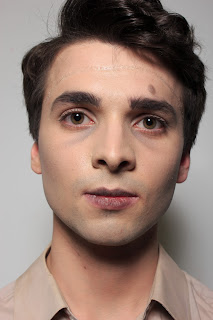
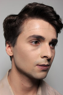
Below is my Technical File Sign off Sheet, which has been signed as 'Complete'.
Showing posts with label Makeup Technical File. Show all posts
Thursday, 21 April 2016
Friday, 8 April 2016
Hexenbiest Mouth
Before I made the decision on what look I wanted to do for Mrs Laderman, I wanted to test out one of my ideas to see whether I can do it with the supplies I have to hand. I used the same technique that we were taught when doing cuts.
PRODUCTS USED
- Wax
- Liquid Latex
- Moisturiser
- Fake Blood
- SupraColour
- Foundation Palette
- Powder
TOOLS USED
- Palette Knives
- Palette
- Baby buds
- Cotton pads
- Brushes
-Cape
I did find it quite difficult at first to get the wax to spread evenly and into the shape that I wanted, but after it warmed up a bit on the skin it was definitely easier to spread. I think another thing that made it more difficult for the wax to spread, was that it kept building up slightly on my knife causing the rest of the wax to pick up as a result. Once I cleaned off my knife it was much easier to spread the wax. Initially I wanted to use latex to create the 'stringy' look, however once I tried doing this, I couldn't get the look that I desired- so I decided to try using rolls of wax to create the look instead. I think that it looks really effective, and is much better than my original idea of latex. I definitely need to work on blending out my edges a lot more so that they are seamless with the rest of the skin, and I think if I used slightly bigger pieces of wax it might be easier to do so. I think that using more wax in the rolls will be easier to work with as the rolls will be less flimsy and less inclined to break- which I was very concerned about especially when applying the layer of latex over the top and drying it. I am very happy with how it looks, I think that from a distance it will look very effective in photographs and I think this will be the look that I do for Mrs Laderman. As this is a very delicate and slightly uncomfortable for my model, I think that when doing the makeup for the look I will do this last so that my model isn't sitting there with this covering her mouth for so long.
Below is the photograph of the final look.
Tuesday, 5 April 2016
Initial ideas for Mrs Laderman
I had three initial ideas for what I could do for Mrs Laderman.
As I wanted to draw out the 'zombie smile', I didn't want to mess up my face charts so I traced the face and used pencils rather than makeup so it does not show up as well as the others. This look is the most complicated out of the three and involves light SFX. To do the smile, I would use the technique that we used to do cuts; by applying wax to the outer corner of the mouth and bringing it out into a triangular shape. I think that in order to get the 'stringy' look that the Hexanbiest's typically tend to have, I would apply liquid latex in strips across the patch of wax. I will need to test this to make sure that it can work properly, and if it doesn't I will have to think of an alternative or choose another design. I did also want to use liquid latex to age around the eye area, as that is what Hexanbiest's look like.
For the second face chart, I decided to do a more 'normal' makeup in comparison to the first. I thought that purple would be a nice contrast to the typical grey smokey eye, and I added extra 'darkness' with the dark purple lip. I thought that even with this simpler makeup, she could still look quite terrifying as it will show the 'human side' to her and that she is acting out of her own volition rather than the magic being the cause.
For the final face chart, I wanted to show a combination of the human and magical side to her character- using the same smokey eye and purple lip as before but adding black 'veins' under the eye. I thought that the black veins would add a sense of mystery to her character, and be another alternative to using SFX makeup. However I think that this would be too theatrical and doesn't keep in as much with the look that the Hexanbiest's have in the show, so I wonder if this isn't the best look to choose.
I would like to style her to look very professional, as in the show the Hexanbiests are shown to dress very nicely and quite smart. This usually creates a contrast between them and every other character in the show, almost to make it seem as though they are better than them. In the case of Mrs Laderman and Quentin, she is of much higher status to him so I think that the clothes will reflect this. My model has a navy blue lace dress which is very smart that I have asked for her to wear for the shoot- I think that dark navy with create a contrast between her and Quentin as I want to style him in white.
Final ideas for Quentin
After the presentation, I did a lot more thinking and research into how I can present Quentin in his photographs. Initially I did have the idea to go down the route of showing him very obviously as a 'Prince', with him wearing some sort of crown. However my idea was to have him wearing a crown made of thorns, which could have been seen to have him almost a symbol for Religion coming to save Claudia from her distress, but after asking the opinion of those around me I decided against this because I thought there was the chance of offending some people- which I don't want to do. As I didn't want to do just thorns, I thought about sourcing a crown and lacing it with thorns- however the ones that I found looked very fake and cheap, so I needed to re-think my idea again.
Upon reflection of my original idea of having a crown, I think that it might look over the top and I think that having him as a symbol of the Prince might be better. I came to this because if he was to be seen in the TV series, he wouldn't be seen with a crown on his head - as none of the 'royal' characters do. I thought that instead I could use the idea of a bloodied bandage over his eyes or pulled down around his neck. When I shoot the character, I will take multiple images showing both and then decide which I like better.
In my initial face charts I did use the idea of contact lenses, however upon deliberation I decided against them due to not being confident putting them in, and also my model not being confident in wearing them. So I have done a final face chart of the look showing this.
I decided on doing the scratches from the thorns over his eye area and down his body, with grazes on his knuckles also. In my initial face charts I did have bruises on his face and chin, however I thought it would be too much. However when I do the look, if it looks like it needs a bit more adding to it, I may add in some defensive bruising to his hands and arms, to show that he is protecting Claudia from Mrs Laderman.
When I shoot him, I want him to be wearing a white shirt that I will rip and add fake blood to. I wanted the styling for him to be very plain and simple because the makeup is quite full on and I don't want to make the photo look over the top. Furthermore the white from the shirt would give a connotation of innocence to the photo, making it seem as though he a victim of Mrs Laderman.
Wednesday, 16 March 2016
Creating Light Scars using Moulds
PRODUCTS
- Mould: which you can fill with Gelatin/silicone
- Petrolese : release spray, which you need to spray onto the mould before
- Pros-aide : prosthetic glue, a flexible glue.
- Pro- Clean: remover of the glue. THIS IS THE ONLY THING THAT WILL REMOVE THE GLUE.
- Kryolan Foundation palette
- Kryolan SupraColour palette
- Fake Blood
- Witch Hazel
- Powder
TOOLS
- Makeup Brushes
- Baby buds
- Cotton pads
- Puff
- Scissors
HEALTH AND SAFETY
- Make sure that hands are clean before touching the model's skin.
- Make sure to cover over the model so that none of the products can transfer onto the clothes.
OTHER TIPS
- Pros-aide is a contact glue, which means that you have to apply glue to the skin as well as the mould.
-You have to make sure that both sides are dry (they will go completely clear) before you stick them together.
- You may have to trim the edges of the mould slightly. It's better to have some rough edges as they won't show up as much on camera in comparison to straight edges.
STEP BY STEP
- Use a baby bud to apply glue onto the mould and the skin.
- Wait until clear, then stick the mould on. You need to press down hard to make sure that it is stuck properly.
- Use Witch-Hazel on a baby bud to melt away the edges of the mould. Use a downwards motion to do this as this will melt the edges better.
- Powder the area to see what edges need melting away.
- Clean away any excess glue around the edges, making sure not to go under the mould as it will cause it to unstick.
- Colour the wound. Make sure that the colour is translucent and not heavy. If the edges are too hard, bring lightly over the edge.
- To remove the mould, just peel off and wipe the excess glue from the skin using the Pro-Clean.
MY INTERPRETATION
| The wound after I applied it to the skin. |
| The wound after I coloured it. |
I did find it incredibly difficult to get all of the edges melted away and I don't think that it looks very good because of this. I did try to blend the red colour out and around to make it look like it was blended in more, but I think that it made it stand out a lot more. I think that adding the fake blood to the wound foes give it an extra element of depth to the wound, making it look a lot better than just using the normal SupraColours. I do think however that I went slightly overboard with trying to blend the black SupraColour into the wound, so that instead of a hint of blackness to the wound it became slightly purple which I don't think looks very realistic.
Another thing that I found slightly tricky to remove was the glue from my arm, I did have to use quite a lot of the Pro-Clean to make sure that it was completely removed from my arm. This makes me wonder if I used a bit to much glue on my arm so that it became more difficult to remove with more product.
Monday, 14 March 2016
First Ideas for Quentin
Below are some initial face charts that I have done with my ideas for how I want Quentin to look. The top chart shows the idea that I had of his eyes bleeding as a result of being thrown into the thorns like the Prince in the story. I wanted to add in the element of bruising and a cut lip to show that he is being affected by Mrs Laderman's abuse alongside Claudia. I did wonder about investing in some contacts that make the eyes look clouded and like he has gone blind, however I need to talk to my model about whether he can wear contacts and the logistics of using blood with them.
The middle chart again shows the idea of him being thrown into the thorns in the story, with his eyes being scratched and bruised as a result of it. I think that using a pin to drag some fake blood across the eye area would look really effective to create the scratches from the thorns, I think with bruised eyes it would look really good. Again I was thinking about using the clouded contact lenses to give the illusion of blindness.
The bottom chart takes out the element of the blindness and just focuses on the abuse of Mrs Laderman on Claudia. I thought that just having his face bruised would make him seem vulnerable and like he is the victim alongside Claudia. If I was to do both Claudia and Quentin then I would have them with identical bruising to show that he is being affected by what is happening to her.
Wednesday, 9 March 2016
Horror and Fashion
In our lesson we were given the choice of different images from runway shows that have influences from horror. I chose the one below from the 2009 John Galliano Fall show.
![]() |
| najeema (2009) Galliano fall/winter 2009 runway makeup. Available at: http://www.astylizedhysteria.com/galiano-fallwinter-2009-runway-makeup/ (Accessed: 9 March 2016). |
I was really drawn to this makeup look because it was very pretty and was very fantasy-like rather than scary. Furthermore I loved the texture that it showed, I thought that the pigment on the cheeks adds a beautiful dewiness to the skin along with the shine that is on the lips.
As I didn't have my liquid metal palette with me, I found it more difficult to get the same density of colour with just the gold from the SupraColour palette. However I used the pigment from Illamasqua on the cheeks to give the highlight, which I think adds a really nice effect to the skin and replicates the dewiness seen in the photo.
I decided to use more purple and pink toned shadows instead of the black and grey, I thought that it would look a bit better with Justine's skin tone. I think that it still keeps in with the tone of the original image, especially with the different textures on the lip and cheeks, but adds a different look to the original idea.
I did try to add some of a pearlescent colour to her lashes, however nothing that I tried worked which is down to me not having my Liquid Metal palette in my kit, which would've been the ideal product to use
Timed Assessment Part 2
Below are the final images from the second part of the Timed Assessment. I'm really happy with how they turned out, I think that I was able to replicate the look well. The images on the left are from the first TA and the images on the right are from the second TA. One element that I am incredibly frustrated about is that the brightness of the lights/flash is different in the two photos- I think this is due to how difficult it is to judge on a camera screen.
Another thing that is different between the two photos is the height of his hair, this I think is due to me lifting the curling wand more when I was curling his hair. However I think that I managed to get the shape of the hair pretty similar in the two photos.
When looking at my final makeup, Sue did mention that I could've coloured the scar on his forehead, so that it does stand out more on the photos. However when I did practise colouring the scar it looked awful and not how I wanted it to look. As I wanted to place the Creature in the novel later on when he was living on his own and finding his own way, I didn't want the scar to look too new, so I only used the Collodian and didn't colour it.
| First TA |
| Second TA |
Wednesday, 2 March 2016
Timed Assessment- Part 1
Below are the four final images from the first part of the Timed Assessment. I'm really happy with the final images, I think that the look is very simple but looks very effective on camera. I'm really happy with my timings for the whole look, all in all it took about an hour to do the entire look including hair, so I think that I will be able to pace myself to focus on the elements that will need extra time to make sure they are perfect- in particular; the under eyes, contouring and the scar.
I took some close up shots for my continuity notes as well, so that I can get the placement of each element exactly the same next week when I replicate the makeup.
Friday, 26 February 2016
Another Practise...
Here is the final photo from another practise I did before the Timed Assessment. I wanted to make sure that I could do both the hair and the makeup in the time that I have in the assessment. It did take more time to do the entire look because I was also taking photos and making notes for continuity.
I think that the scar looks a lot better as it does stretch across the entire forehead, rather than just in the middle.
One element that I didn't like about this practise was the darkness underneath the eyes. I think that the black under the eye is too extreme and doesn't look as 'natural' as my previous practise. I think to make sure that I make the eyes look as 'natural' as possible, I need to not over-apply the colour and make sure that everything is properly blended.
I hope that all my continuity notes will enable me to complete the look during the assessment time and replicate each element to look the same each time.
Wednesday, 24 February 2016
First Practise of Design
Below are the first images of the practise for my makeup design. I'm really proud of how it turned out along with how well it looks in the photographs. I was very apprehensive about where to put the facial scar, but thinking about where Frankenstein would've cut open the Creature it made sense to have the scar going horizontally across the forehead (in the place where he needed to access the brain).
I did experiment with adding colour to the scar, however I was so disappointed with it I just removed it and decided that it looked better being left. When I did colour the scar it did look slightly like I had just cut open the forehead which wasn't the look I was after. I will definitely need to make sure that I make lots of continuity notes so that I can get the scar looking exactly the same in each assessment. Furthermore I think that I need to bring the scar a lot further across the forehead so that it is seamless and 'blends' in well.
One element that I think might be difficult is getting the colours and blending exactly the same each time I do it, so I do need to make sure that with the next practise I take lots of pictures with quantities and close ups of each element. Doing another practise before the assessment will make me feel a lot more confident with doing the entire look with hair for the two assessments.
Dirt and Dirty Teeth
Products:
- Tooth Enamel: in black and yellow
- Fuller's Earth: can use wet or dry
- AquaColour (to add a powdery colour effect to the Fuller's Earth)
- SupraColour (to colour over the top of Fuller's Earth)
- Surgical Spirit
- Water: to add to the Fuller's Earth
Tools:
- Baby Buds
- Paint Palette
- Paintbrushes
- Bowl
- Hairdryer
HEALTH AND SAFETY
- You can't use the Tooth Enamel on newly bleached teeth/some caps.
- DO NOT SWALLOW SURGICAL SPIRIT.
- As an alternative to Surgical Spirit, you can use whitening toothpaste but it might not do as good a job as Surgical Spirit.
- Don't double dip in the product.
- Test the heat of the hairdryer on yourself before using on a model.
- Make sure to cover up your model so that you don't get any product on them or their clothing.
- Scoop out Fuller's Earth from your bowl and put in the bin to clean it out.
EXTRA
- If you want to colour the inside of the mouth you can use food colouring.
-You can also ask your model to suck on some liquorice which will blacken the inside of the mouth.
STEP BY STEP - DIRTY TEETH:
- Shake the bottle to make sure that the product is properly mixed.
- Use a baby bud to apply the product onto the teeth.
- If any product goes on the lips, use surgical spirit to remove it.
- You can use the black to block out teeth entirely.
- The yellow will give the rotten look to the teeth.
- You can also use a fine brush to shape the teeth.
STEP BY STEP- DIRT/MUD:
- You can use this in its powder form, and add it to the face/hair to give the illusion of dirt/dust.
- Add water to the dust to create a paste, which you can apply to the skin with your hands. It's better to apply with your hands as you won't get brush strokes which you would if you used a brush.
- Remember to open up the fingers to get the product right into the crevices. Do the same with the knuckles as it will look odd when the product doesn't go right into the crevices.
- Dry with a warm hairdryer, until it goes white in colour.
- You can add colour to the Fuller's earth with the SupraColour, AquaColour or the Kryolan sprays.
- Remove using water.
My Interpretation - Teeth
I did find it quite difficult to get a good coating of the product on the teeth so it does look very patchy. I think the cotton buds gave it a patchy look and I would've been better off using a paintbrush if I wanted to create an opaque colour. I did begin to use the cotton buds for the black, however I found it very difficult to get clean lines on the teeth, so I changed to a paintbrush which I found much easier to block out the entire tooth. The final teeth are slightly messy and some parts needed cleaning up with the surgical spirit, however I think that the small speck of black that I can see on one of the clean teeth would be difficult to clean up without taking off some of the other colour. In future I definitely need to be more careful when applying the product onto the teeth so I can avoid little specks like the ones I had before.
My Interpretation- Mud
I really liked using this product, it was really fun to work with and I think that it gives a nice effect to the skin. I think that if you caked the product on in multiple layers then it would make a nice look of having just crawled through a lot of mud.
I did have an issue with the Kryolan spray colours as the brown one did come out in splatters which tried to concentrate in small parts of the hand which didn't go to plan, as the photo demonstrates. I think rather than using the Kryolan spray colours in future I'd prefer to colour using my SupraColour or AquaColour. However I think if I was to use the Spray colour again, I would make sure to spray it in a smaller/larger area so that it doesn't look patchy.
| After colouring with the aerosol colours |
Thursday, 18 February 2016
Practising Continuity
We were given the task of creating either; a bold eye, a bold lip or a black eye, which we would then have to take off and replicate again to see if we could.
I chose to do a black eye as I didn't get the chance to do one in class. Below is the photo that I used for inspiration for my eye.
![]() |
| no date) Available at: https://c1.staticflickr.com/1/84/254429419_3cb45de484_b.jpg (Accessed: 18 February 2016). |
MY FIRST ATTEMPT AND CONTINUITY PHOTOS
I scraped out the colours that I thought I would need into my palette, taking pictures of the amounts- I did take more than I actually used on the face and just used the left-overs for the second application.
Firstly I applied the yellow from the SupraColour palette under the eyes and into the inner corner. So that the colour wasn't so opaque I blended it out and away with both my fingers and a brush so make it a more subtle colour on the skin.
I then mixed a small bit of the orange in with the yellow and applied a thin layer of this over the yellow, concentrating on the area just underneath the eye.
I then proceeded to add in the lighter red on the lower lash line along with defining the puffiness underneath the eye. I did have to blend out the colour on the lower lash line so that it wasn't a complete block and looked more natural.
The next step was to add the darker red to the parts where I already applied the light red, and then I mixed a tiny amount of the black SupraColour in with the darker red just to add even more definition to the bruise.
The final step was to add Vaseline to the eye to give it a shiny effect.
The Final Eye.
I'm quite proud of how this turned out, especially as I have never done a black eye before. One element that I didn't like was the colour of the yellow- in the Kryolan bruise palette the yellow is much more mustard toned which I think would've looked a lot better.
THE REPLICATION
This is my replication of the eye. Although it definitely isn't perfect I think that it is close to the original. The shape and colours need to be brought down a bit more on the face and rounded off more at the bottom. Furthermore the orange colour right under the eye needed to be a lot brighter.
My model was quite squirmy as he has not had makeup applied before so he was finding it an odd process- this made me rush the second black eye slightly as he was feeling uncomfortable having the makeup applied (not an allergy to the products, just a discomfort to the unknown process of having makeup applied).
Wednesday, 17 February 2016
Rashes, Sweat, Tears and Pallour
Products
- SupraColour Palette
- Eyelash glue
- Liquid Latex
- Moisturiser
- Cleanser
- Glycerine
- Water/Contact lens solution
- Vaseline
-Concealer Palette
Tools
- Brushes
- Pins
- Palette knife
- Baby buds
- Black stippling sponge
HEALTH AND SAFETY
- Don't put anything in the eyes that doesn't belong there
- Make sure hands are clean before touching the skin
Other tips
- Cover up the imperfections on the skin using the Concealer Palette, for HD less makeup is better.
- Use fingers to blend the product, heat melts the product into the skin.
- You can use brown eyeliner to map the shape for black eyes so that continuity is better.
- Use facial markers to make it easier for continuity.
- If you want to pale out the skin for illness, mix SupraColour or Illamasqua white base with the Kryolan foundation palette.
- Use Glycerine for sweat, it will stay a lot better than water.
- For tears, drop water or contact lens solution into the tear duct.
- Can use food colouring to colour the inside of the mouth.
- Different eyes have different colours during illness : fever eyes- red, tired eyes- blue
STEP BY STEP- RASHES / REDNESS
- Moisturise well so that the skin has a nice shine.
- Look for any imperfections that need concealing.
- Add some moisturiser onto the back of the hand and mix it with the red from the SupraColour palette.
- Stipple the colour onto the cheeks, blending in any harsh edges with your fingers- this will create fever cheeks. Remember to go into the hairline.
- To create the illusion of a person who has been crying, add red to the nose and under the eyes.
- If a person is; tired: they have red ears
- If a person is; ill: they have pale ears
- Remember to go down the neck, along with right up to the lashes when doing eyes.
- Use a fine detail brush to apply colour onto the lids and feather it out.
- You can also mix IPA with the SupraColour to stipple onto the skin and create a blotchy look.
STEP BY STEP - DRY LIPS
- You can use Latex or Eyelash Glue to do this.
- Apply onto the lips, and use a pin to pick it up and create the illusion of chapped lips.
- You can also add blood/ red to add an extra soreness to the lips.
STEP BY STEP- SWEAT
- You don't need a lot of glycerine for this.
- Using a black stippling sponge, take the glycerine onto the back of the hand and stipple where you want sweat to be.
- Typical places include; upper lip, forehead and nose.
- Wetting the hair can also add the sweaty look.
STEP BY STEP- TEARS
- This is the last thing you would do before taking a picture.
- When using disposable contact lens solution, break the end of the file.
- Ask your model to sit with their eye open wide and head back.
- Drop the solution into the tear duct, and ask the model to bring their head back forward.
- You can also add a drop of glycerine onto the face to create a single tear.
STEP BY STEP- BLACK EYE
- Moisturise the eye area so that it shines.
- Look at pictures for inspiration, and to look at the stage that the bruise was at.
- Make sure to apply the colour into the corner into the corner of the eye and up to the lashes, blending the colour with your fingers.
- Add shine to the area by adding Vaseline.
- Moisturise the eye area so that it shines.
- Look at pictures for inspiration, and to look at the stage that the bruise was at.
- Make sure to apply the colour into the corner into the corner of the eye and up to the lashes, blending the colour with your fingers.
- Add shine to the area by adding Vaseline.
MY INTERPRETATION- RASHES/REDNESS
I decided to do rashes/redness. I did want it to look quite severe and like Megan was extremely ill. The lighter red colour from the SupraColour palette was a lot more difficult to stipple on as it was a lot subtler than the darker red, meaning that I had to apply multiple layers of it. The stippling song did give a mottled effect to the colour, however I really did need to blend in some of the elements with my fingers as it looked too spotty. I think that I could've taken the product a bit further onto the brow bone as well as under the eye so that it looked like it had spread and looked even more serious. At the beginning I did have a bit of trouble with the application, as I applied the colour to the nose and it didn't look like it blended in with the rest of the colour on the face, so I had to remove it.
When Sue came round to check our work she said that I needed to blend out my edges a lot more so that it didn't look like a block of colour on the skin. I did this using a small flat brush to 'dab' at the colour to blend it out, however it did cause it to look a bit similar to sunburn. I think that I needed to blend a bit less so that it still had the mottled effect to the skin.
I think that to add to the effect of the entire face, I could've added in some sweat to make Megan look more ill and like the rash has a reason to be on the face.
BLACK EYE
Much like a lot of the Special Effects makeup that I have done, I think that this is quite theatrical. I really like how mottled the darker colour looks underneath the eye, I did add in a light amount of yellow and blended it around the edges just to give it a slight hint of healing but still looking quite sore. One element that I am frustrated about is I forgot to add on some Vaseline so that it looks shiny, I think because of this is looks quite flat on the face and the shine would've made it look much more effective.
SWEAT
TEARS
I wanted to test out the Glycerine for doing just one tear on the face. I think that it looks really effective running down the face. However I think that I needed to go in slightly closer to the without touching it, just so that it blends in with the eye slightly better.
I decided to do rashes/redness. I did want it to look quite severe and like Megan was extremely ill. The lighter red colour from the SupraColour palette was a lot more difficult to stipple on as it was a lot subtler than the darker red, meaning that I had to apply multiple layers of it. The stippling song did give a mottled effect to the colour, however I really did need to blend in some of the elements with my fingers as it looked too spotty. I think that I could've taken the product a bit further onto the brow bone as well as under the eye so that it looked like it had spread and looked even more serious. At the beginning I did have a bit of trouble with the application, as I applied the colour to the nose and it didn't look like it blended in with the rest of the colour on the face, so I had to remove it.
When Sue came round to check our work she said that I needed to blend out my edges a lot more so that it didn't look like a block of colour on the skin. I did this using a small flat brush to 'dab' at the colour to blend it out, however it did cause it to look a bit similar to sunburn. I think that I needed to blend a bit less so that it still had the mottled effect to the skin.
I think that to add to the effect of the entire face, I could've added in some sweat to make Megan look more ill and like the rash has a reason to be on the face.
BLACK EYE
SWEAT
I think that the Glycerine looks really effective on the skin, it definitely looks as though Megan is dripping in sweat. I think I did slightly over apply and the Glycerine did start to run down her face which wasn't very pleasant for her,
TEARS
I wanted to test out the Glycerine for doing just one tear on the face. I think that it looks really effective running down the face. However I think that I needed to go in slightly closer to the without touching it, just so that it blends in with the eye slightly better.
Subscribe to:
Posts (Atom)